

AI作图提示词
核心看点:这篇文章提供「时尚品牌 · 产品与营销」提示词,核心用途是生成时尚、摄影、3D、Logo、品牌、产品相关的视觉作品。复制下方提示词后,把方括号里的对象、品牌、颜色或风格替换成你的项目要求,就可以用于网站配图、广告物料和内容封面。
Nano Banana品牌产品时尚摄影3DLogo品牌
时尚品牌 · 产品与营销. 可直接复制的 AI 作图提示词
时尚品牌 · 产品与营销.是一组适合用于 AI 图像生成的作图提示词,可用于品牌视觉、产品展示、海报封面、社媒配图和创意内容生产。更多同类内容可查看 作图提示词。
提示词
[BRAND NAME] + [PRODUCT] Act as a Senior Luxury Fashion Art Director and Studio Photographer special
izing in high-end product key visuals for flagship campaigns, e-commerce editorials, and mobile-first brand content.
PHASE 1: FORMAT & CANVAS Vertical format, 9:16 aspect ratio.
Canvas background: a single flat field of warm off-white — not pure white, not grey.
Target tone: soft ivory cream (#F4EFE6 equivalent), uniform and completely shadowless across the ent
ire background plane.
Autonomously determine [BRAND NAME]'s signature background tone — if the brand has a recognized hous
e color for its packaging, tissue paper, or lookbook backgrounds, shift the canvas toward that speci
fic off-white or neutral.
The result must feel like an official brand document, not a generic studio.
PHASE 2: BACKGROUND PATTERN (WATERMARK LAYER) Autonomously identify [BRAND NAME]'s iconic surface pa
ttern, monogram, or archival motif — examples: a house monogram, toile print, geometric logo repeat
heritage emblem, or signature textile pattern.
Render this pattern across the entire background canvas as a ghost watermark: same tone as the backg
round but with a slight value shift (approximately 8–12% darker or lighter than the base).
The pattern must be large in scale — individual motifs spanning 15–25% of canvas width.
Opacity: 10–18% maximum.
No hard edges.
The pattern should feel embossed or tone-on-tone woven, not printed.
It must recede behind all other elements.
PHASE 3: LOGO PLACEMENT Autonomously reproduce [BRAND NAME]'s official logo with complete fidelity —
correct letterforms, proportions, secondary marks (emblems, crowns, stars, monogram icons).
Place the logo centered horizontally in the upper third of the frame (top 30% of canvas).
Scale: the logo should span approximately 40–50% of canvas width — prominent but not overwhelming.
Logo rendering: flat 2D, no extrusion, no chrome.
Color: autonomously apply [BRAND NAME]'s official logo colorway — the exact brand-standard color(s)
used on official packaging and website.
If the brand uses a two-tone logo (icon + wordmark in different colors), preserve that hierarchy precisely.
Directly below the main logo mark, place the full [BRAND NAME] wordmark in spaced capital letters —
clean, geometric sans-serif, tracking: +200 to +300, same brand color, optical size approximately 60% of logo height.
No decorative elements between logo and wordmark.
PHASE 4: PRODUCT PLACEMENT Render [PRODUCT] as a photorealistic studio object with maximum material
fidelity: — Leather: visible grain, pore structure, stitching thread texture, realistic edge paint.
— Hardware: gold or silver metal with micro-reflections, not flat.
— Canvas/fabric: woven fiber detail, not smooth CG.
— All brand-specific surface patterns on the product must be accurate and legible.
Placement: the product enters the frame from the bottom-right corner at a natural 25–35 degree angle
as if casually placed or mid-motion.
The product is cropped — only 60–75% of the object is visible within the frame.
The crop should feel intentional and editorial, not accidental.
The product occupies the lower 55–65% of the canvas.
The product must feel physically present in the space — not floating.
Cast an extremely soft, barely visible contact shadow (opacity 8–12%) on the canvas beneath the nearest edge.
No hard drop shadows.
PHASE 5: LIGHTING Lighting: simulated large north-facing studio window light.
Soft, directional, shadowless on the background.
Color temperature: 5500–6000K (neutral daylight, slightly cool).
Key light: large softbox equivalent from upper-left, filling the entire product surface evenly with
minimal contrast ratio (1.2:1 to 1.5:1 max).
Fill light: large bounce from right side, eliminating all harsh shadows.
No rim light.
No dramatic contrast.
The lighting philosophy is: "the product sells itself — light only reveals, never performs." Global
Illumination enabled for subtle inter-reflections between product surfaces.
No specular hotspots on leather — only on metal hardware.
PHASE 6: TYPOGRAPHY & FINISHING Bottom of frame: a thin horizontal rule line (1px, brand color, 80%
canvas width, centered).
Below the rule: a single line of micro-copy — a social handle, collection name, or campaign label —
in the same clean sans-serif, lowercase or small-caps, minimal tracking.
Autonomously generate a contextually appropriate label for [BRAND NAME].
TECH SPECS Render engine: photorealistic CGI, Keyshot / Octane product visualization aesthetic.
Resolution: 9:16, ultra-high detail.
Depth of Field: f/16 equivalent — everything in sharp focus.
Zero bokeh.
Tack-sharp edges on all product details.Tone mapping: clean, true-to-life.
No filmic crush.
No vignette.
No grain.
Color grade: neutral, faithful to real product color.
Slight warmth in the ivory background only.
No AI-plastic normals on leather or fabric.
Microscopic surface imperfection maps required.
No reflections on background.
No environmental reflections — studio only.
Mood reference: Louis Vuitton / Bottega Veneta / Celine official e-commerce and campaign photography standard.
Clean enough to be used as a press image.
[BRAND NAME] + [PRODUCT] Act as a Senior Luxury Fashion Art Director and Studio Photographer special
izing in high-end product key visuals for flagship campaigns, e-commerce editorials, and mobile-first brand content.
PHASE 1: FORMAT & CANVAS Vertical format, 9:16 aspect ratio.
Canvas background: a single flat field of warm off-white — not pure white, not grey.
Target tone: soft ivory cream (#F4EFE6 equivalent), uniform and completely shadowless across the ent
ire background plane.
Autonomously determine [BRAND NAME]'s signature background tone — if the brand has a recognized hous
e color for its packaging, tissue paper, or lookbook backgrounds, shift the canvas toward that speci
fic off-white or neutral.
The result must feel like an official brand document, not a generic studio.
PHASE 2: BACKGROUND PATTERN (WATERMARK LAYER) Autonomously identify [BRAND NAME]'s iconic surface pa
ttern, monogram, or archival motif — examples: a house monogram, toile print, geometric logo repeat
heritage emblem, or signature textile pattern.
Render this pattern across the entire background canvas as a ghost watermark: same tone as the backg
round but with a slight value shift (approximately 8–12% darker or lighter than the base).
The pattern must be large in scale — individual motifs spanning 15–25% of canvas width.
Opacity: 10–18% maximum.
No hard edges.
The pattern should feel embossed or tone-on-tone woven, not printed.
It must recede behind all other elements.
PHASE 3: LOGO PLACEMENT Autonomously reproduce [BRAND NAME]'s official logo with complete fidelity —
correct letterforms, proportions, secondary marks (emblems, crowns, stars, monogram icons).
Place the logo centered horizontally in the upper third of the frame (top 30% of canvas).
Scale: the logo should span approximately 40–50% of canvas width — prominent but not overwhelming.
Logo rendering: flat 2D, no extrusion, no chrome.
Color: autonomously apply [BRAND NAME]'s official logo colorway — the exact brand-standard color(s)
used on official packaging and website.
If the brand uses a two-tone logo (icon + wordmark in different colors), preserve that hierarchy precisely.
Directly below the main logo mark, place the full [BRAND NAME] wordmark in spaced capital letters —
clean, geometric sans-serif, tracking: +200 to +300, same brand color, optical size approximately 60% of logo height.
No decorative elements between logo and wordmark.
PHASE 4: PRODUCT PLACEMENT Render [PRODUCT] as a photorealistic studio object with maximum material
fidelity: — Leather: visible grain, pore structure, stitching thread texture, realistic edge paint.
— Hardware: gold or silver metal with micro-reflections, not flat.
— Canvas/fabric: woven fiber detail, not smooth CG.
— All brand-specific surface patterns on the product must be accurate and legible.
Placement: the product enters the frame from the bottom-right corner at a natural 25–35 degree angle
as if casually placed or mid-motion.
The product is cropped — only 60–75% of the object is visible within the frame.
The crop should feel intentional and editorial, not accidental.
The product occupies the lower 55–65% of the canvas.
The product must feel physically present in the space — not floating.
Cast an extremely soft, barely visible contact shadow (opacity 8–12%) on the canvas beneath the nearest edge.
No hard drop shadows.
PHASE 5: LIGHTING Lighting: simulated large north-facing studio window light.
Soft, directional, shadowless on the background.
Color temperature: 5500–6000K (neutral daylight, slightly cool).
Key light: large softbox equivalent from upper-left, filling the entire product surface evenly with
minimal contrast ratio (1.2:1 to 1.5:1 max).
Fill light: large bounce from right side, eliminating all harsh shadows.
No rim light.
No dramatic contrast.
The lighting philosophy is: "the product sells itself — light only reveals, never performs." Global
Illumination enabled for subtle inter-reflections between product surfaces.
No specular hotspots on leather — only on metal hardware.
PHASE 6: TYPOGRAPHY & FINISHING Bottom of frame: a thin horizontal rule line (1px, brand color, 80%
canvas width, centered).
Below the rule: a single line of micro-copy — a social handle, collection name, or campaign label —
in the same clean sans-serif, lowercase or small-caps, minimal tracking.
Autonomously generate a contextually appropriate label for [BRAND NAME].
TECH SPECS Render engine: photorealistic CGI, Keyshot / Octane product visualization aesthetic.
Resolution: 9:16, ultra-high detail.
Depth of Field: f/16 equivalent — everything in sharp focus.
Zero bokeh.
Tack-sharp edges on all product details.Tone mapping: clean, true-to-life.
No filmic crush.
No vignette.
No grain.
Color grade: neutral, faithful to real product color.
Slight warmth in the ivory background only.
No AI-plastic normals on leather or fabric.
Microscopic surface imperfection maps required.
No reflections on background.
No environmental reflections — studio only.
Mood reference: Louis Vuitton / Bottega Veneta / Celine official e-commerce and campaign photography standard.
Clean enough to be used as a press image.
适合的使用场景
- 品牌官网、产品详情页、博客封面和专题页视觉。
- 小红书、公众号、短视频封面、广告创意草图等内容生产。
- Logo 延展、包装概念、复古风格、3D 质感或主题化品牌画面。
使用建议:先复制提示词,替换主体、品牌名、颜色、材质、背景和画面比例;如果要保持系列感,请固定品牌色、构图、镜头语言和光线描述。
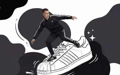
图片参考
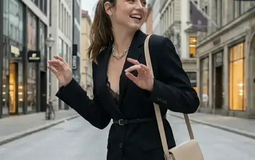
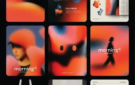
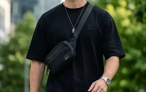
编辑总结:时尚品牌 · 产品与营销.提示词适合快速生成同主题视觉素材。你也可以继续查看 作图提示词,把同一类视觉内容做成系列。
© 版权声明
文章版权归xinghuos.com注册作者所有,未经允许请勿转载。资源仅供学习交流,有条件者请支持原作者。如有版权或内容准确性问题请联系我司协商处理,收到通知后24小时内处置。
THE END






暂无评论内容