

AI作图提示词
核心看点:这篇文章提供「广告 · 信息图与设计」提示词,核心用途是生成人像、时尚、摄影、3D、品牌、产品相关的视觉作品。复制下方提示词后,把方括号里的对象、品牌、颜色或风格替换成你的项目要求,就可以用于网站配图、广告物料和内容封面。
Nano Banana信息设计人像时尚摄影3D品牌
广告 · 信息图与设计. 可直接复制的 AI 作图提示词
广告 · 信息图与设计.是一组适合用于 AI 图像生成的作图提示词,可用于品牌视觉、产品展示、海报封面、社媒配图和创意内容生产。更多同类内容可查看 作图提示词。
提示词
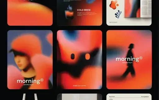
[BRAND NAME] Act as a Senior Brand Identity Designer and CGI Art Directorspecializing in high-end ou
tdoor advertising mockups and poster system design for contemporary brands.
PHASE 1: SCENE & ENVIRONMENT Render a photorealistic CGI scene of a large-format poster(citylight fo
rmat, approximately 120×175cm) standing upright on a concrete urban sidewalk, leaning against an architectural wall.
The poster is NOT mounted — it physically rests with its bottom edge on the pavement, top slightly a
ngled awayfrom the wall (5–8 degrees from vertical).
THE WALL: Brutalist architectural concrete — smooth pre-cast panels with visible horizontal seams/jo
ints at regular intervals.
Color: warm light grey (#c8c4be).
Surface texture: fine aggregate concrete, micro-porous, not painted.
Dappled shadow from out-of-frame organic elements (tree branches, foliage) falls diagonally across t
he wall surface behind the poster.
These shadows are soft-edged, natural,not symmetrical — they add depth to the flat wall and create a
n organic counterpoint to the geometric poster.
THE GROUND: Same concrete material as the wall — continuous urban paving.
The poster casts a subtle directional shadow on the ground,consistent with the key light direction.
POSTER FRAME: Slim aluminum citylight frame, matte dark charcoal (#2a2a2a).
Frame width: ~1.5–2% of poster width.
Simple flat profile.
Corner joints visible.
Slight specular highlight on frame edge.
PHASE 2: POSTER ARTWORK CONSTRUCTION POSTER BACKGROUND COLOR SYSTEM: Do NOT default to off-white.
Autonomously determine the poster's background color based on [BRAND NAME]'s primary brand palette —
use the most iconic, recognizable background color associated with [BRAND NAME]'s visual identity: ·
If [BRAND NAME] owns a strong primary color (red, orange,black, navy, green) — use a light or muted
tint of that color as the poster background (e.g., if brand = red, background = pale blush or warm c
ream with red undertone) · If [BRAND NAME] is inherently minimal/neutral (white, grey) — use warm of
f-white (#ede8e2) as the base · The background must always remain light enough that dark blob shapes
and dark typography have full legibility · The entire poster color system (background + blob color +
outline blob color) must feel unmistakably on-brand for [BRAND NAME] — a viewer should recognize the
brand from color alone before reading the wordmark BLOB COLOR OVERRIDE: The solid filled blobs do NO
T have to be near-black.
Autonomously select the blob fill color from [BRAND NAME]'s brand palette — it must create strong co
ntrast against the poster background.
Examples: · Brand with red identity → deep burgundy or black blobs · Brand with green identity → dar
k forest or black blobs · Brand with orange identity → deep brown or black blobs · Luxury brand → ma
tte black always works The outline blob stroke color: autonomously select the most contrasting accen
t color from [BRAND NAME]'s palette (could be white, brand color, gold, etc.) LAYER A: PHOTOGRAPHIC
TEXTURE PANELS Multiple blob cells in the grid (2–3 blobs) are filled with macro or close-up photogr
aphy of a natural or industrial material that is culturally and conceptually core to [BRAND NAME]'s
identity or product world.
Autonomously determine what material best represents [BRAND NAME] — examples of logic: · Outdoor/nat
ure brand → moss, bark, stone, water surface · Fashion brand → raw fabric weave, leather grain, silk
· Tech brand → circuit board macro, brushed metal, glass · Food/beverage brand → coffee grounds, gra
in texture, citrus cross-section, raw ingredient macro · Automotive brand → carbon fibre weave, leat
her interior, brushed aluminium detail These texture blobs sit at THE SAME Z-LEVEL as solid blobs —
they are cells in the same grid, not a background layer.
Each texture photo is cropped precisely to its blob shape.
No photo bleeds outside its blob boundary.
The color palette of textures must complement the overall brand color system of the poster.
LAYER B: BLOB SHAPE SYSTEM A set of 7–9 geometric-organic shapes arranged in a loose 2-column × 3-ro
w modular grid across the poster surface.
Shapes are a mix of: pill/stadium shapes (horizontal and vertical), near-circles, and one irregular organic blob.
THREE TYPES OF BLOB CELLS — all on the same Z-level, all part of one unified grid: TYPE 1 — SOLID FI
LLED BLOBS (3–4 shapes): Filled with the brand-determined dark color (see above).
Fully opaque.
Sizes vary intentionally.
TYPE 2 — TEXTURE BLOBS (2–3 shapes): Filled with macro material photography (Layer A).
Photo cropped exactly to blob shape.
No overflow.
TYPE 3 — OUTLINE BLOB (1 shape): A single organic flowing shape rendered as thin stroke only — no fi
ll, transparent interior.
Stroke weight: ~3px at final render scale.
Color: brand accent color.
LARGER than individual solid blobs — flows across multiple grid zones, overlapping both solid and texture blobs.
Reads as a ghosted form.
Adds air and movement.
Sits on top of the grid as the only element that crosses blob boundaries.
GRID LOGIC: Row 1 (top): 2 horizontal pill shapes — one solid, one texture Row 2 (middle): 2 near-ci
rcular blobs — one texture, one solid + the HERO blob (see Layer C) positioned here or between rows
2 and 3, slightly larger than surrounding cells Row 3 (bottom): 1 wide horizontal pill (solid) spann
ing ~80% of poster width + 1 smaller circle (solid) to the right The outline blob flows from row 1 t
hrough row 3 diagonally.
ALL BLOBS: same z-level.
No blob floats above another.
No shadows between blobs.
Clean flat grid logic.
LAYER C: BRAND SIGNATURE OBJECT — INSIDE BLOB MASK CORE PRINCIPLE — PRODUCT INSIDE THE MASK: The her
o product is NOT placed on top of the composition.
It does NOT float above the blob grid.
It does NOT have its own drop shadow on the poster background.
It does NOT have its own background (white, gradient, or other).
ONE blob cell in the grid functions as a SHAPED WINDOW — the product photo is cropped precisely to t
hat blob's shape, exactly like the texture photos in Layer A, at the same z-level as all other blobs.
The product exists INSIDE its blob.
The blob shape IS the product's frame.
Nothing extends beyond the blob edge.
HERO BLOB SELECTION: · Position: center or just below center of the grid · Size: autonomously make t
his blob 20–30% larger than neighboring cells — it is the visual focal point · Surrounding cells: mi
x of solid + texture blobs create rhythm and frame the hero window naturally PRODUCT DETERMINATION —
autonomously select based on [BRAND NAME]'s category: BEVERAGE / FOOD BRAND: → Hero drink or food pr
oduct, shot from slight overhead angle.
Macro surface detail (crema, condensation, texture).Product fills 70–85% of blob interior.
Tight crop.
AUTOMOTIVE BRAND: → Do NOT attempt to fit full car in one blob.
Option A: dramatic macro detail — grille, wheel, headlight, interior — one detail per blob, 2 adjace
nt blobs used Option B: split panoramic — car body flows across 2 horizontally adjacent blobs as one
continuous image split by the gap between cells.
FASHION / APPAREL BRAND: → Option A (garment-led brands): single iconic garment, flat lay or ghost m
annequin, cropped to blob shape.
Fabric texture visible at macro level.
→ Option B (lifestyle/streetwear brands): human figure cropped from shoulder to mid-thigh, no face i
n frame, wearing brand's most iconic outfit.
Blob crops the figure.
Autonomously choose whichever communicates the brand identity more powerfully.
FOOTWEAR BRAND: → Single shoe in dramatic 3/4 angle.
Tight crop inside blob.
Sole detail or material texture as secondary texture blob.
TECH / ELECTRONICS BRAND: → Hero device at dynamic angle.
Screen detail or hardware macro.
Clean product shot aesthetic inside the blob.
LUXURY / ACCESSORIES BRAND: → Hero product (bag, watch, jewellery) in dramatic close-up.
Material detail (leather grain, metal finish) as texture blobs.
PRODUCT PHOTOGRAPHY RULES INSIDE BLOB: · Same lighting direction as poster key light (upper-right) ·
Product fills 70–85% of the blob's interior · Photo feels art-directed for this exact shape · No whi
te background behind product inside blob · No drop shadow from product onto poster background · Prod
uct photo color palette must complement the overall poster brand color system POSTER TYPOGRAPHY: BOT
TOM LEFT (inside margin, 5% from edges): A short brand tagline — 4–8 words — that authentically capt
ures [BRAND NAME]'s mission, product, or ethos.
Written as if [BRAND NAME]'s own Creative Director wrote it.
Typeface: geometric sans-serif, regular weight.
Size: ~2% of poster height.
Color: darkest color in the poster's brand palette.
BOTTOM RIGHT (inside margin, 5% from edges): [BRAND NAME] wordmark / logotype.
Autonomously match [BRAND NAME]'s actual typographic identity.
Same color as tagline.
Slightly larger than tagline text.
NO OTHER TEXT anywhere on the poster.
NO body copy.
NO URLs.
NO prices.
NO decorative type.
ONLY: tagline bottom-left + wordmark bottom-right.
PHASE 3: LIGHTING Primary key light: natural sunlight from upper-right, approximately 45 degrees above horizon.
Warm daylight (5500–6000K).
Creates: · Directional shadow of poster frame on wall (falls left) · Subtle specular highlight on ri
ght edge of frame · Dappled tree shadows on wall — same light source, consistent direction Poster su
rface: matte paper finish, no specular reflection.
Frame edges catch specular highlight from key light.
Ambient: cool open-sky fill from left — natural outdoor balance.
No artificial lighting.
No neon.
No night scene.
PHASE 4: CAMERA & COMPOSITION Orientation: Portrait, 4:5 ratio Camera: Eye-level (160cm), centered o
n poster, ~10% offset to the left — more wall texture visible on right side.
Distance: poster fills ~65% of frame height.
Full poster visible — zero cropping of poster edges.
Above poster: wall with dappled shadows (~25% of frame).
Below poster: pavement visible (~10% of frame).
Depth of Field: f/8 — poster and wall both tack-sharp.
Lens: 50mm equivalent — no barrel distortion.
Tilt: 3 degrees downward — poster reads stable, not falling.
TECH SPECS Render engine: Octane Render or V-Ray (photorealistic mode) Resolution: 4096 x 5120px (4:
5 portrait) Samples: 4096 minimum, full Global Illumination Poster paper: subtle cotton-fibre surfac
e texture, matte, not glossy, not backlit Concrete: micro-aggregate texture visible at 100% zoom Pos
t: Natural daylight grade.
Contrast lift +8.
No heavy vignette.
No warm Instagram filter.
Clean editorial.
Style references: Bureau Borsche poster mockups, Mucho Studio brand campaigns, Build in Amsterdam en
vironmental graphics, Zak Group publication design.
CRITICAL — TEXT EMBARGO: Zero text, letters, digits, symbols, or glyphs anywhere in the image EXCEPT
the tagline and wordmark defined above.
No signs, no street text, no labels on products beyond what is physically part of the product itself.
NEGATIVE: No product floating above blob grid.
No drop shadows from product on poster background.
No product with its own white or gradient background.
No sky.
No people outside the poster.
No vehicles outside poster.
No busy urban scene behind the wall.
No AI plastic sheen.
No off-brand colors.
No generic stock photo aesthetic.
No blob at a different z-level than its neighbors.
[BRAND NAME] Act as a Senior Brand Identity Designer and CGI Art Directorspecializing in high-end ou
tdoor advertising mockups and poster system design for contemporary brands.
PHASE 1: SCENE & ENVIRONMENT Render a photorealistic CGI scene of a large-format poster(citylight fo
rmat, approximately 120×175cm) standing upright on a concrete urban sidewalk, leaning against an architectural wall.
The poster is NOT mounted — it physically rests with its bottom edge on the pavement, top slightly a
ngled awayfrom the wall (5–8 degrees from vertical).
THE WALL: Brutalist architectural concrete — smooth pre-cast panels with visible horizontal seams/jo
ints at regular intervals.
Color: warm light grey (#c8c4be).
Surface texture: fine aggregate concrete, micro-porous, not painted.
Dappled shadow from out-of-frame organic elements (tree branches, foliage) falls diagonally across t
he wall surface behind the poster.
These shadows are soft-edged, natural,not symmetrical — they add depth to the flat wall and create a
n organic counterpoint to the geometric poster.
THE GROUND: Same concrete material as the wall — continuous urban paving.
The poster casts a subtle directional shadow on the ground,consistent with the key light direction.
POSTER FRAME: Slim aluminum citylight frame, matte dark charcoal (#2a2a2a).
Frame width: ~1.5–2% of poster width.
Simple flat profile.
Corner joints visible.
Slight specular highlight on frame edge.
PHASE 2: POSTER ARTWORK CONSTRUCTION POSTER BACKGROUND COLOR SYSTEM: Do NOT default to off-white.
Autonomously determine the poster's background color based on [BRAND NAME]'s primary brand palette —
use the most iconic, recognizable background color associated with [BRAND NAME]'s visual identity: ·
If [BRAND NAME] owns a strong primary color (red, orange,black, navy, green) — use a light or muted
tint of that color as the poster background (e.g., if brand = red, background = pale blush or warm c
ream with red undertone) · If [BRAND NAME] is inherently minimal/neutral (white, grey) — use warm of
f-white (#ede8e2) as the base · The background must always remain light enough that dark blob shapes
and dark typography have full legibility · The entire poster color system (background + blob color +
outline blob color) must feel unmistakably on-brand for [BRAND NAME] — a viewer should recognize the
brand from color alone before reading the wordmark BLOB COLOR OVERRIDE: The solid filled blobs do NO
T have to be near-black.
Autonomously select the blob fill color from [BRAND NAME]'s brand palette — it must create strong co
ntrast against the poster background.
Examples: · Brand with red identity → deep burgundy or black blobs · Brand with green identity → dar
k forest or black blobs · Brand with orange identity → deep brown or black blobs · Luxury brand → ma
tte black always works The outline blob stroke color: autonomously select the most contrasting accen
t color from [BRAND NAME]'s palette (could be white, brand color, gold, etc.) LAYER A: PHOTOGRAPHIC
TEXTURE PANELS Multiple blob cells in the grid (2–3 blobs) are filled with macro or close-up photogr
aphy of a natural or industrial material that is culturally and conceptually core to [BRAND NAME]'s
identity or product world.
Autonomously determine what material best represents [BRAND NAME] — examples of logic: · Outdoor/nat
ure brand → moss, bark, stone, water surface · Fashion brand → raw fabric weave, leather grain, silk
· Tech brand → circuit board macro, brushed metal, glass · Food/beverage brand → coffee grounds, gra
in texture, citrus cross-section, raw ingredient macro · Automotive brand → carbon fibre weave, leat
her interior, brushed aluminium detail These texture blobs sit at THE SAME Z-LEVEL as solid blobs —
they are cells in the same grid, not a background layer.
Each texture photo is cropped precisely to its blob shape.
No photo bleeds outside its blob boundary.
The color palette of textures must complement the overall brand color system of the poster.
LAYER B: BLOB SHAPE SYSTEM A set of 7–9 geometric-organic shapes arranged in a loose 2-column × 3-ro
w modular grid across the poster surface.
Shapes are a mix of: pill/stadium shapes (horizontal and vertical), near-circles, and one irregular organic blob.
THREE TYPES OF BLOB CELLS — all on the same Z-level, all part of one unified grid: TYPE 1 — SOLID FI
LLED BLOBS (3–4 shapes): Filled with the brand-determined dark color (see above).
Fully opaque.
Sizes vary intentionally.
TYPE 2 — TEXTURE BLOBS (2–3 shapes): Filled with macro material photography (Layer A).
Photo cropped exactly to blob shape.
No overflow.
TYPE 3 — OUTLINE BLOB (1 shape): A single organic flowing shape rendered as thin stroke only — no fi
ll, transparent interior.
Stroke weight: ~3px at final render scale.
Color: brand accent color.
LARGER than individual solid blobs — flows across multiple grid zones, overlapping both solid and texture blobs.
Reads as a ghosted form.
Adds air and movement.
Sits on top of the grid as the only element that crosses blob boundaries.
GRID LOGIC: Row 1 (top): 2 horizontal pill shapes — one solid, one texture Row 2 (middle): 2 near-ci
rcular blobs — one texture, one solid + the HERO blob (see Layer C) positioned here or between rows
2 and 3, slightly larger than surrounding cells Row 3 (bottom): 1 wide horizontal pill (solid) spann
ing ~80% of poster width + 1 smaller circle (solid) to the right The outline blob flows from row 1 t
hrough row 3 diagonally.
ALL BLOBS: same z-level.
No blob floats above another.
No shadows between blobs.
Clean flat grid logic.
LAYER C: BRAND SIGNATURE OBJECT — INSIDE BLOB MASK CORE PRINCIPLE — PRODUCT INSIDE THE MASK: The her
o product is NOT placed on top of the composition.
It does NOT float above the blob grid.
It does NOT have its own drop shadow on the poster background.
It does NOT have its own background (white, gradient, or other).
ONE blob cell in the grid functions as a SHAPED WINDOW — the product photo is cropped precisely to t
hat blob's shape, exactly like the texture photos in Layer A, at the same z-level as all other blobs.
The product exists INSIDE its blob.
The blob shape IS the product's frame.
Nothing extends beyond the blob edge.
HERO BLOB SELECTION: · Position: center or just below center of the grid · Size: autonomously make t
his blob 20–30% larger than neighboring cells — it is the visual focal point · Surrounding cells: mi
x of solid + texture blobs create rhythm and frame the hero window naturally PRODUCT DETERMINATION —
autonomously select based on [BRAND NAME]'s category: BEVERAGE / FOOD BRAND: → Hero drink or food pr
oduct, shot from slight overhead angle.
Macro surface detail (crema, condensation, texture).Product fills 70–85% of blob interior.
Tight crop.
AUTOMOTIVE BRAND: → Do NOT attempt to fit full car in one blob.
Option A: dramatic macro detail — grille, wheel, headlight, interior — one detail per blob, 2 adjace
nt blobs used Option B: split panoramic — car body flows across 2 horizontally adjacent blobs as one
continuous image split by the gap between cells.
FASHION / APPAREL BRAND: → Option A (garment-led brands): single iconic garment, flat lay or ghost m
annequin, cropped to blob shape.
Fabric texture visible at macro level.
→ Option B (lifestyle/streetwear brands): human figure cropped from shoulder to mid-thigh, no face i
n frame, wearing brand's most iconic outfit.
Blob crops the figure.
Autonomously choose whichever communicates the brand identity more powerfully.
FOOTWEAR BRAND: → Single shoe in dramatic 3/4 angle.
Tight crop inside blob.
Sole detail or material texture as secondary texture blob.
TECH / ELECTRONICS BRAND: → Hero device at dynamic angle.
Screen detail or hardware macro.
Clean product shot aesthetic inside the blob.
LUXURY / ACCESSORIES BRAND: → Hero product (bag, watch, jewellery) in dramatic close-up.
Material detail (leather grain, metal finish) as texture blobs.
PRODUCT PHOTOGRAPHY RULES INSIDE BLOB: · Same lighting direction as poster key light (upper-right) ·
Product fills 70–85% of the blob's interior · Photo feels art-directed for this exact shape · No whi
te background behind product inside blob · No drop shadow from product onto poster background · Prod
uct photo color palette must complement the overall poster brand color system POSTER TYPOGRAPHY: BOT
TOM LEFT (inside margin, 5% from edges): A short brand tagline — 4–8 words — that authentically capt
ures [BRAND NAME]'s mission, product, or ethos.
Written as if [BRAND NAME]'s own Creative Director wrote it.
Typeface: geometric sans-serif, regular weight.
Size: ~2% of poster height.
Color: darkest color in the poster's brand palette.
BOTTOM RIGHT (inside margin, 5% from edges): [BRAND NAME] wordmark / logotype.
Autonomously match [BRAND NAME]'s actual typographic identity.
Same color as tagline.
Slightly larger than tagline text.
NO OTHER TEXT anywhere on the poster.
NO body copy.
NO URLs.
NO prices.
NO decorative type.
ONLY: tagline bottom-left + wordmark bottom-right.
PHASE 3: LIGHTING Primary key light: natural sunlight from upper-right, approximately 45 degrees above horizon.
Warm daylight (5500–6000K).
Creates: · Directional shadow of poster frame on wall (falls left) · Subtle specular highlight on ri
ght edge of frame · Dappled tree shadows on wall — same light source, consistent direction Poster su
rface: matte paper finish, no specular reflection.
Frame edges catch specular highlight from key light.
Ambient: cool open-sky fill from left — natural outdoor balance.
No artificial lighting.
No neon.
No night scene.
PHASE 4: CAMERA & COMPOSITION Orientation: Portrait, 4:5 ratio Camera: Eye-level (160cm), centered o
n poster, ~10% offset to the left — more wall texture visible on right side.
Distance: poster fills ~65% of frame height.
Full poster visible — zero cropping of poster edges.
Above poster: wall with dappled shadows (~25% of frame).
Below poster: pavement visible (~10% of frame).
Depth of Field: f/8 — poster and wall both tack-sharp.
Lens: 50mm equivalent — no barrel distortion.
Tilt: 3 degrees downward — poster reads stable, not falling.
TECH SPECS Render engine: Octane Render or V-Ray (photorealistic mode) Resolution: 4096 x 5120px (4:
5 portrait) Samples: 4096 minimum, full Global Illumination Poster paper: subtle cotton-fibre surfac
e texture, matte, not glossy, not backlit Concrete: micro-aggregate texture visible at 100% zoom Pos
t: Natural daylight grade.
Contrast lift +8.
No heavy vignette.
No warm Instagram filter.
Clean editorial.
Style references: Bureau Borsche poster mockups, Mucho Studio brand campaigns, Build in Amsterdam en
vironmental graphics, Zak Group publication design.
CRITICAL — TEXT EMBARGO: Zero text, letters, digits, symbols, or glyphs anywhere in the image EXCEPT
the tagline and wordmark defined above.
No signs, no street text, no labels on products beyond what is physically part of the product itself.
NEGATIVE: No product floating above blob grid.
No drop shadows from product on poster background.
No product with its own white or gradient background.
No sky.
No people outside the poster.
No vehicles outside poster.
No busy urban scene behind the wall.
No AI plastic sheen.
No off-brand colors.
No generic stock photo aesthetic.
No blob at a different z-level than its neighbors.
适合的使用场景
- 品牌官网、产品详情页、博客封面和专题页视觉。
- 小红书、公众号、短视频封面、广告创意草图等内容生产。
- Logo 延展、包装概念、复古风格、3D 质感或主题化品牌画面。
使用建议:先复制提示词,替换主体、品牌名、颜色、材质、背景和画面比例;如果要保持系列感,请固定品牌色、构图、镜头语言和光线描述。
图片参考



编辑总结:广告 · 信息图与设计.提示词适合快速生成同主题视觉素材。你也可以继续查看 作图提示词,把同一类视觉内容做成系列。
© 版权声明
文章版权归xinghuos.com注册作者所有,未经允许请勿转载。资源仅供学习交流,有条件者请支持原作者。如有版权或内容准确性问题请联系我司协商处理,收到通知后24小时内处置。
THE END






暂无评论内容